Contact
- Email: hello@peggypease.com
- Phone: 602.831.8026
- Scottsdale, Arizona
Outdated agency website gets a much needed UX/UI makeover.
The Arizona Department of Veterans' Services is a state agency that provides critical, state-wide coordination and technical assitance to services and organizations serving US Veterans. The current website is antiquated and confusing. Although it is responsive, it has the look and feel of a much older site, navigation is not intuitive, and information is hard to find.
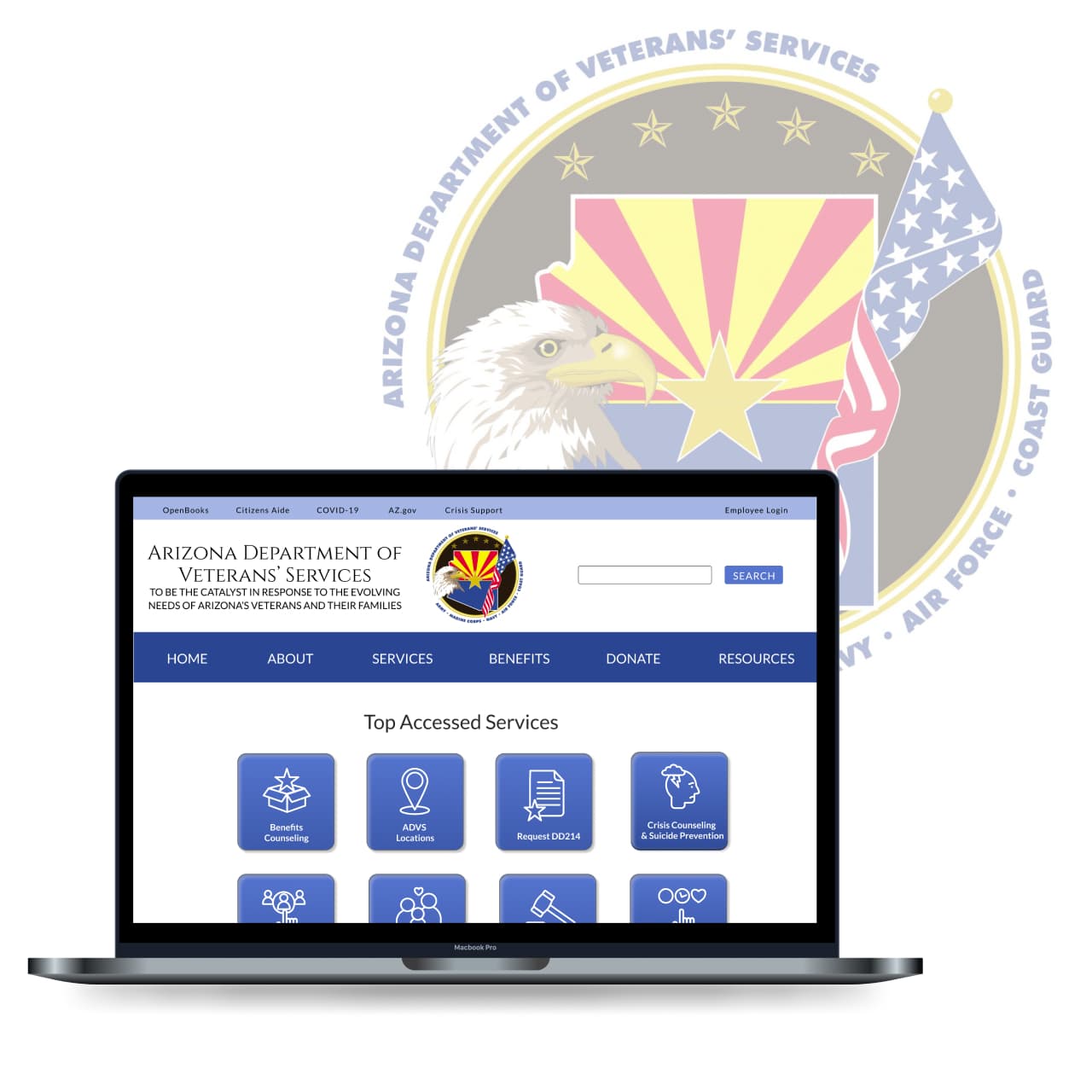
A complete website reorganization and rebuild. Special attention was paid to ease of navigation and creating visual continuity.
UX and UI Designer, Individual Project
4 Weeks
During the research phase I conducted 5 user interviews to gain a better understanding of how easy and intuitive the site was navigation was. Users were also given the specific task of finding the “Tuition Waiver Form” page and eligiblity requirements.
"The website it cluttered, if it's not in the (main) menu, I won't look for it any more"
- Devin
"I guess it's ok, IF you already know where to look".
- Amie
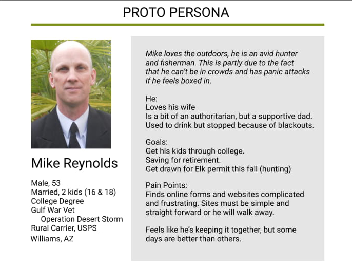
Based on current US veteran demographics provided by the Veterans Administration, link I created a Proto Persona to help focus on a typical user and keep his/her needs and limitations in the forefront of the design process.
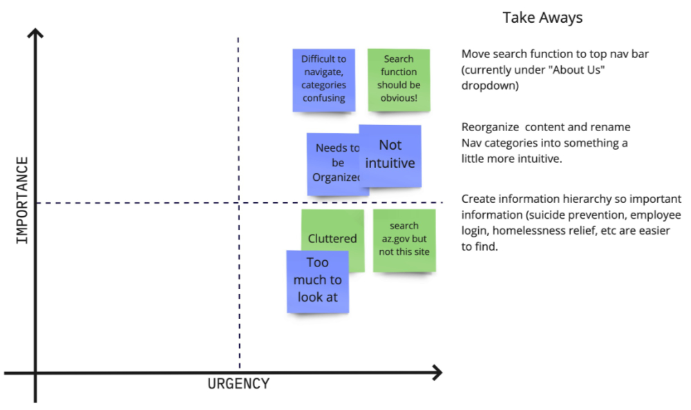
I believe that with clearer navigation, an obvious "Search" function, and logical information hierarchy users will accomplish their goals quicker and with less frustration. User testing indicated that it took an average of 3 attempts to finally locate the information they sought.
By reorganizing the information architecture and navigation menu, I believe users will experience less frustration while using the website and come away with a much more postitive impression of the agency.
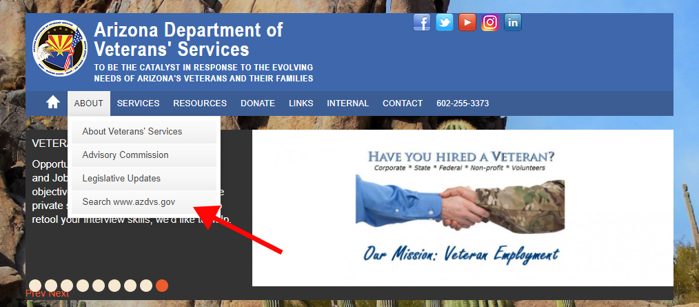
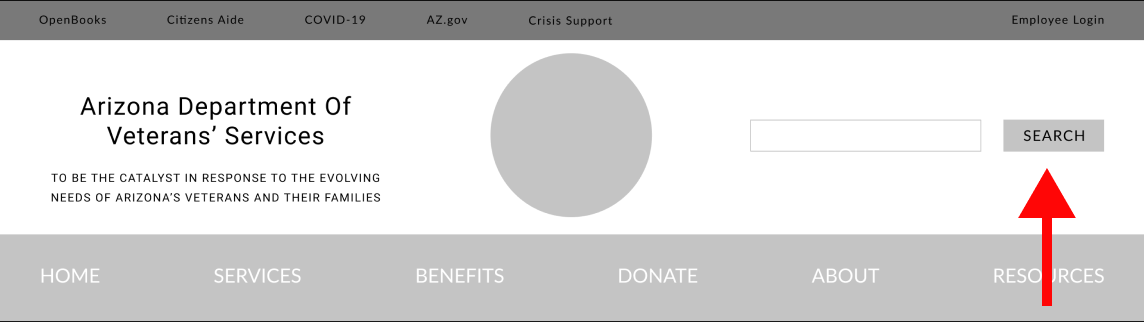
A main priority based on user testing and my own observations was to make searching the site easier by moving the function to a far more user friendly location.

Sourced online, I only found poor quality, mismatched, freeby icons (left). The solution was to create my own (right).
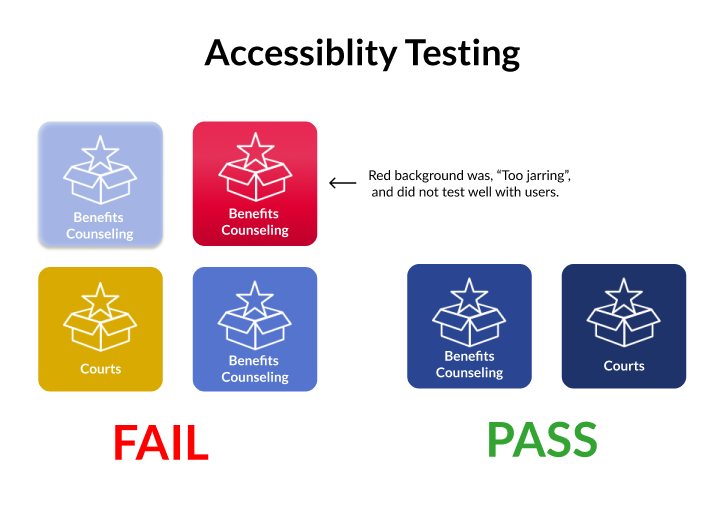
Gold was the original color choice for the "Most Accessed" buttons. It didn't pass accessibility testing however, and needed to be replaced. A darker gold looked muddy and red buttons, later tested, were deemed "Too jarring", by some testers.
After clickable prototypes were built in Figma, I conducted and tested my high fidelity design with 5 volunteers. The goal of the testing was to assess whether users found the navigation easier and more intuitive and whether they could find the information they wanted with less frustration.
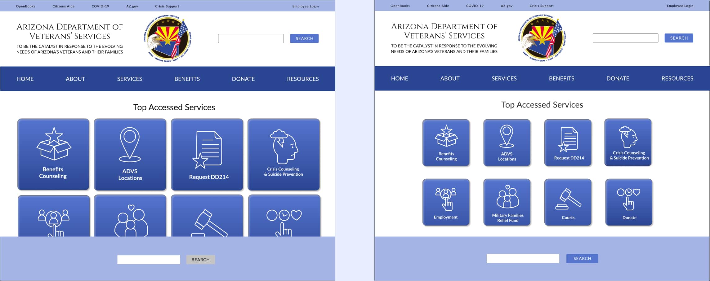
The buttons on the left were, "Just too big" according to testers. By resizing them they now fit above the fold.
Additional User Testing Findings:

While adding visual interest, the red accordion dropdown menu was deemed, "Too jarring" by users and was scrapped.
Tempted to make my subheading read "Final Clickable Prototypes", I'm aware that a design is never really "done", and there will always be something I can revisit. I guess I can say this is my Final Clickable Prototype...for now!


Every project presents different challenges and learning opportunities, and this one was no different. One of the more startling things I learned was just how extensive the original site was. It appeared to have been added to and tweaked over the years, rather than reorganized and redesigned. At the onset I thought about how satisfying it would be to really redesign it, by the end of the project however, I knew just how monumental the task would be. I found that Information Architecture is far more interesting that I ever would have guessed, and that even the best thought out color scheme can be problematic.